Creative Hour | April 2026

Welcome to our monthly Creative Hour. No agenda, no pressure. Just a bunch of us getting together to chat about anything and everything in the world of production and beyond. New ads we’ve loved (or hated), films we can’t stop thinking about, clever edits, weird trends, or that one shot that made us pause and go “how did the f*** did they even do that?”
Coinbase Ad: Nostalgia & The Cultural Zeitgeist
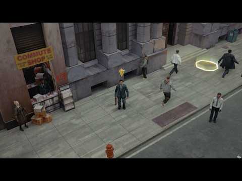
Starting off strong, the Coinbase ad “Your Way Out” debuted at the 2026 Academy Awards, and it was a stroke of genius.
OK, we’re Oscar Hudson fans. Sue us.
The whole thing was shot in-camera, a nice reminder that you don’t have to throw VFX at everything to make something stick. It’s the craft that elevates the story. We like work where the craft is tied to the creative idea and not just layered on top because someone fancied it.
They built a whole world through craft. Deliberate “low-res” set design, costume and choreography. It feels like a world straight out of GTA, a pretty direct line to the kind of person this ad is aimed at. We all imagine the Venn diagram of people who loved GTA and people punting money into meme coins is probably close to a circle.
“It’s culturally pertinent. It taps into the current cultural zeitgeist”
The whole theme is NPCs breaking out of the video game (AKA the System, AKA the Matrix, AKA the Rat Race) and finding financial freedom outside traditional norms. The messaging aligns with how people are thinking right now.
“I was watching Louis Theroux: The Manosphere last night, and whether you like it or not, the Overton Window around the idea that we’re living in a system designed to keep people financially stuck is shifting. A solid quarter of that doc focused on their idea of “The Matrix”, so it’s clearly not some fringe concept anymore”
It’s part of the mainstream conversation now and clearly something that hits emotionally.
“It’s no longer just something you'd hear a stranger mutter into their warm can of dark fruits at 3 am in someone’s kitchen.”
The crescendo built towards the end had me wanting to run through a wall and put my entire life savings into a meme coin. Thankfully, this is next to f*ck all.
Needless to say, the production quality impressed us all. They avoided that over-produced temptation and kept the 90s/noughties aesthetic intact.
Using nostalgia to target a whole generation works. It resonates. Like when they brought back Neil Buchanan from Art Attack for a Muller Corner advert. “Oh my god. He’s still going.”
You can watch the BTS here.
And lastly, Sammy Davis Jr. No explanation needed.
Netflix Podcasts: Flexible Brand Identity System
Netflix launched a podcast streaming service that leans on its existing brand identity, while still carving out something distinct. Super clean system built around quotation marks in Netflix Sans.
The whole look is stripped back but really deliberate: images, boxes, quotation marks and bold type doing all the heavy lifting.
“It feels very YouTube, though, doesn't it?”
And yeah, that tracks. But it works.
The beauty of it is how modular it feels. You’ve got a system that’s clearly defined, but flexible enough to move across loads of different applications without losing its identity.
We got into the idea of building the brand system before the content. Lock in the identity first, then let everything else plug into it. It gives you something that scales properly. Every output feels fresh, but still recognisably part of the same world.
And because the branding is so simple, it stretches. Social, thumbnails, campaigns, whatever. It holds.
Sure, they’ve got the advantage of brand recognition, which definitely gives them the luxury of keeping things this minimal.
“Every use I've seen of it, I'm like, oh, that's different. But it's really fun.”
That’s kind of the sweet spot, isn’t it? Consistent but never boring.
We also talked about moving beyond traditional brand guidelines. Thinking more in terms of modular systems clients can actually use and adapt. Definitely something we’re keen to push more in our own projects.

Bill’s Supra: AI-Generated Innovation
We got into Bill’s Supra, built using Easy Peasy Ease & Node Banana, a JSON script from Willie Falloon. It’s a side project, open and free to use, designed to fix one of the biggest issues with AI-generated clips: those janky transitions between start and end frames.
Because let’s be honest. Most of the time, they look a bit shit. Weird jitter, odd pacing, clips that don’t quite flow.
“The problem with AI stuff with start and end frames is that they're always janky whenever you put them together, or they stop a little bit, and the movement isn't consistent”
This basically smooths all that out. It standardises the easing between clips so everything feels intentional rather than accidental.
There’s also a drag-and-drop functionality, which makes moving between clips ridiculously easy. No need for traditional editing software. Everything transitions cleanly with minimal effort. It’s just completely hands off.
But that doesn’t mean it’s effortless.
Getting good results with AI still comes down to the prompts. The level of detail going into them is kind of mad. We were literally like, look at the effort going into these prompts. That’s where the skill comes in, right? Knowing how to guide the tools, not just use them.
“Every single part has just been done with prompts and AI, it's never gone into editing software”
Even with all the automation, there’s still a craft to making something feel cohesive and actually good.
From there, we shifted into Omoda’s approach to car ads. Basically, the opposite direction.
“So much of car stuff is, like, fake. Omoda's new one is all about it being really real.”
Instead of leaning into AI, they went all-in on practical. Shooting the car across loads of simulated environments in a studio, and everything was captured in-camera to push that sense of realism.
It’s a pretty deliberate move. Using real-world craft to stand out in a space that’s increasingly heading the other way.
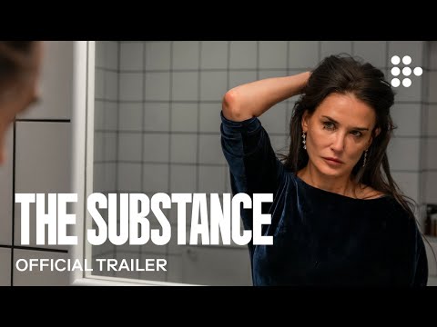
The Substance: Not Your Average Horror
Then we got into The Substance, and straight away, the set design came up as a massive part of how the film works.
“I feel that it's very much at the forefront, reflecting the psychological state of the characters in question”
There’s this really stripped-back approach, with minimal clutter, and it gives the whole thing a kind of timeless feel. Even though it’s clearly set in the 80s, it doesn’t feel locked to that era. It could’ve been made 10 years ago, or 10 years from now.
The set design and framing were doing a lot of the storytelling heavy lifting. It’s got this really high-end, almost commercial feel to it. Super polished and intentional.
Everything’s framed dead-on, centred, precise. It’s got that Instagram feel where everything has to look perfect.
But what’s interesting is that it does all of that without relying on phones or social media in the story.
“It's probably one of the most beautiful body horror films I've ever seen. It's gorgeous”
And it really is. Bright, vivid, almost glossy at times, which is the opposite of what you expect from horror.
We also got into specific spaces, like the bathroom. It’s all white tiles, sharp edges. Very clinical. Almost like a lab. That idea of it being this kind of experimental chamber really stuck. It mirrors what’s going on in her head. Obsessing over beauty, control, perception.
“The bathroom is such a huge part of the film”
The fisheye lens came up, used around male characters to make everything feel a bit warped and confronting. You can’t really escape it when it’s on screen.
From there, the convo shifted into what the film’s actually saying, especially around beauty standards in Hollywood. We talked about that pressure, especially on women.
“Women have to be beautiful, perfect.”
And how the film leans into the idea that beauty has an expiry date, that women are treated like a commodity with a shelf life.
“The bathroom is such a huge part of the film...it's kind of like this experimental chamber that Demi Moore is in where she really pours over her own perception of her beauty.”
If We Had To Sum It Up…
Good ideas still beat big budgets. Craft over gimmicks every time.
In-camera, practical work just hits differently when it’s tied properly to the concept. At the same time, AI isn’t going anywhere. It’s just another tool, and the real skill is knowing how to use it well.
Simple, modular brand systems are having a moment, and for good reason. If you get the foundations right, everything else becomes easier (and way more scalable).
There’s also a clear pull towards authenticity right now, whether that’s nostalgic visuals, practical effects, or just making things feel a bit more real.
If you got this far, congrats. And thanks for reading!
Join us right here next month for another creative sesh. While you’re waiting, you can check out our other creative blogs.
