Creative Roundup | May 2021

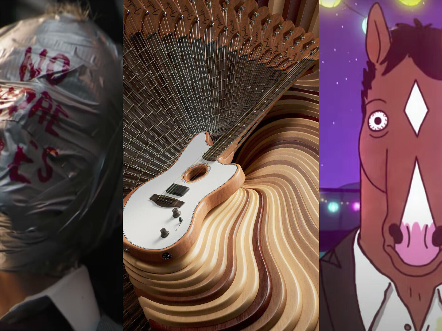
Howdy! Every Wednesday lunchtime, us Storm & Shelter lot get together as a team to spend some time totally saturated in creative ideas.
With a new theme each week, we’re all tasked to bring things we’ve seen that fit the bill and chat about what drew us to ’em. Lively debate, a heap of laughs and a hefty dollop of inspiration is served to keep us on our toes and get our brains firing on all cylinders.
Every month, we’ll share with you our top picks from the past couple of weeks; giving your brain a creative kick up the butt to get out there and make stuff!
The power of music
We took a look into how a music track can influence a piece of content. We discussed why these tracks resonated with people so much and what made certain pieces were perfect for a film or brand.
The Batman Trailer
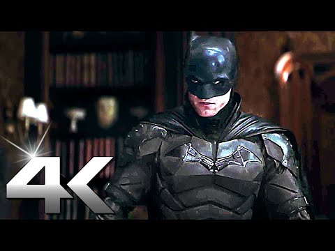
“The use of a well-known Nirvana track and the associated tragedy of that band, along with the eery, downtrodden tone creates an immediate, almost subliminal feeling of sadness and dread, which carries the viewer through the trailer. This already established from the get-go, any additional sound design or dialogue only heightens the experience.”
Lewis Jelley
Technical Director & Cinematographer
Suicide Squad Trailer

“This certainly does the job of creating hype around the film. Yet another use of a well-known song. The crescendo is paired brilliantly with the build of the action in the scenes. What really makes it though is the sound effect elements taken from the scenes that hit the percussion of the song and are peppered throughout breaks in the lyrics/beat.“
Josh Bennett
Film Director
Looking for Something
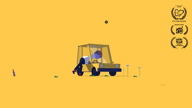
“I adore this. The music composition and SFX from Thomas Williams work incredibly well together here to create this world that this character lives in; playfully adding to the sense of wonder and mystery from start to finish. Not to mention the absolutely gorgeous art style.”
Alex Bull
Lead Motion Designer
Key Takeaways
More than ever, especially with the rise of platforms like TikTok, music is being used more and more to set moods, tell jokes or stir emotion in content. Luckily, music production is much more accessible nowadays, so we’re almost saturated with choices of music to use. This is also why it’s so important to choose the right track; it’s an Ace in the pocket if you get it right. But even if you get it wrong. And people hate it, they’ll still be talking about it.
Title Sequences that you wouldn't skip
Delving into the art form of opening titles, we chatted about how a great title sequence can empower a film or TV series; but are they dying out? And why?
The Crown

“The way the crown is slowly built up over the entire sequence, coupled with really majestic yet mysterious music really helps pique your interest. I find myself gripped watching this as it’s so well made. The shot at 56 seconds silhouetting the crown really helps imply that the crown as an institution is this untouchable, out of reach, and hidden in shadow thing that most people know almost nothing about. That is then reflected in the show – this is the first real ‘peak behind the curtain’ that most people have had. Plus how can you just skip the masterpiece that is Hans Zimmer?“
Michael Kenny
Editor
Bojack Horseman
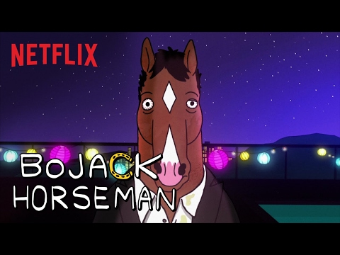
“A very well thought out title as it transports the audience through beautifully crafted scenes of a day with the main man himself. Each season has interchangeable scenes and easter eggs depending on the themes, tone and content. Coupled with that sweet sweet track, it is a pleasure to watch, every time!“
Eryn Sivak
Motion Designer
Fully Flared
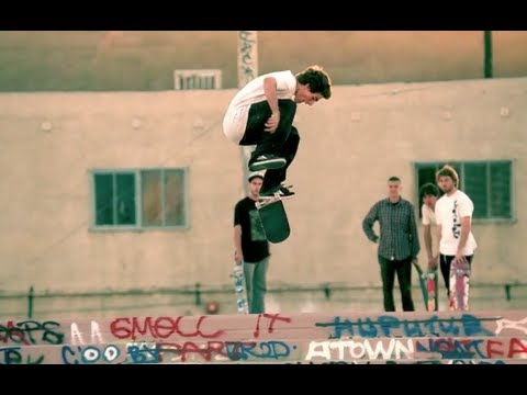
“Back in 2007 when skate films were almost unilaterally shot on Sony VX cameras, and intro sequences were fisheye montages, this sequence, Directed by Spike Jonze, literally came out of nowhere and no one was expecting it. Although HD in skateboarding is still a divisive issue, this high concept and cinematic style has paved the way for countless other action and sports films (Art of Flight, We Are Blood).“
Lewis Jelley
Technical Director & Cinematographer
Key Takeaways
It's really interesting that we are sometimes fooled by a title sequence being good, simply because we love the catchy song or the show/film itself. The power of our favourite TV shows ey?!
Surprising techniques
We were all on the lookout for something that stood out, made you sit up and go “ooh!” The subject here was examples of innovative and creative exploration that just added something special.
The American Acoustasonic Jazzmaster

“Such a mesmerizing way of visualizing the feeling of playing a guitar. Man vs Machine have done it (yet again) with this perfect example of exaggerated motion and outside the box thinking.”
Alex Bull
Lead Motion Designer
'Swingers'
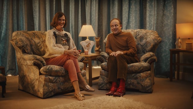
“Is there anything too kitsch for this ad? 100% not. From the blue crystal key bowl to the art deco-esque lamp that resides so snuggly on the side table, this ad ticks all of those boxes. I first heard it on the radio, and of course hearing Jennifer Saunders’ voice in my kitchen will always be unexpected, but so was the first few lines of this ad. Her ‘happy-go-lucky’ tone and hint at the exploratory nature of the couple in question made me turn my head slightly to side amidst my washing up and go ’eh?!’. AND THEN, it all makes sense! This ad took me on a journey, one that still catches me out, and who doesn’t love an unexpected turn eh?“
Natalie Roberts
Production Coordinator
Hell or Habito

“Caught my eye late at night on tv because it is so visually different to what you would expect from this sort of client/content. It is generally such an interesting approach/brand campaign for a younger audience, as opposed to a man just stood in a suit.“
Eryn Sivak
Motion Designer
Key Takeaways
With content being so heavily saturated at the moment, it’s always refreshing to see people take a risk, change things up or try something that just gives their work a hint of spice, a little kick. Editing techniques, camera movements and visual style have all come up in conversation today; Keep an eye out for what made you go “Oooh!” and have a think about why it caught your attention.
Thanks for reading!
So, that’s it for another month of creative exploration and inspiration. We learned it’s super important to take a creative risk now and again, that music can immortalise a piece (whether good or bad!) and that title sequences are a bit of a guilty pleasure for most of us!
Keep your eyes open for next months’ Creative Roundup for more of the good stuff.
For more inspiration, read our related blogs on the topic of creativity and check out our creativity content.
