Cardiff University
Nurse Staffing
Another strong brief from Cardiff University with a focus on how research into nurse staffing decisions differs from the reality of those staff working in the field.
An important topic and one we were fortunate enough to be able to bring to life with animation. With complete creative freedom due to there being no brand guidelines, and a top-tier client, we really got to run with this one and make it what we wanted. This gave our mograph team a broad scope of how we could approach this in both design and animation style.
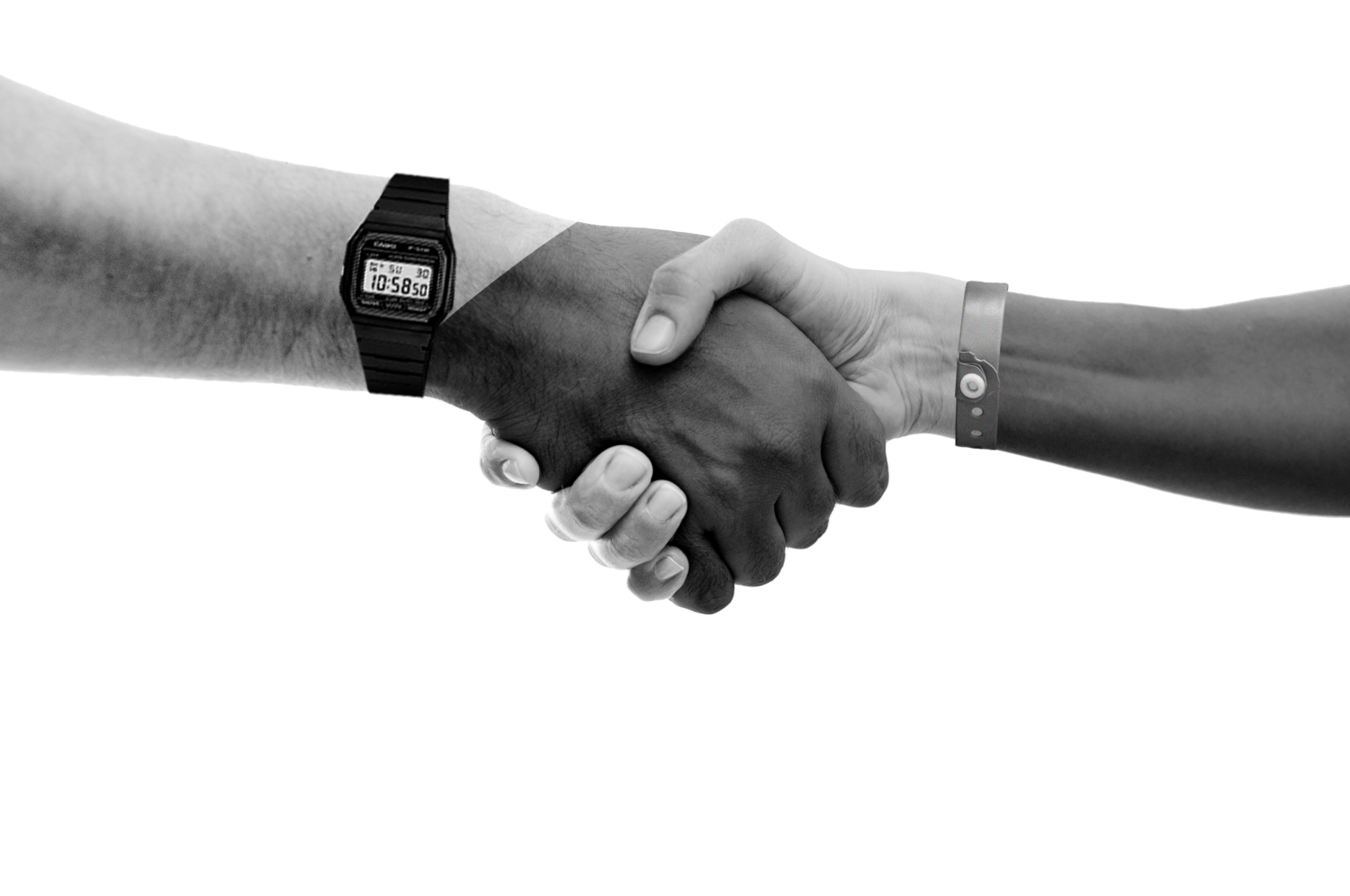
Getting a message across regarding ‘people’ without showing physical people in our design was a challenge we were really interested in developing. We needed it to feel inclusive in order to ensure everyone felt their voice was heard. With some clever thinking at the design stage, we decided to design hands and other elements so their origin felt ambiguous, diverting any questions around this immediately, allowing the messaging to sing, which was super important to us.
We really got to utilise a big chunk of the team on this one, from creative and script writing through to our designers and animators, a whole host of opinions and clever creative were brought together in a solid piece of work, and even on a pretty tight budget. This also gave Lewys a chance to take steer as creative and ensure that he had eyes on the project at all stages.
Developing through this project with Davina and the team was seamless, they let us take creative lead and had full faith that what we planned to produce was going to hit everything they wanted. What a treat when you can focus on doing what you do best and making something that everyone can be proud of, including that all important end client.
The team brought energy, enthusiasm, sensitivity and creativity to the project, and worked with us in a truly collaborative endeavour. Not only did the product exceed all expectations, but we were also enriched by the process.
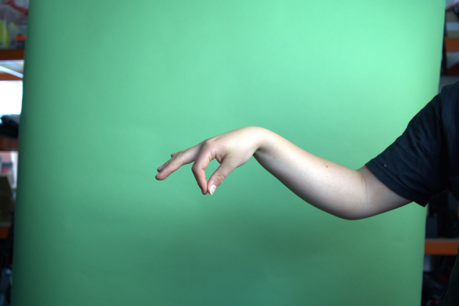
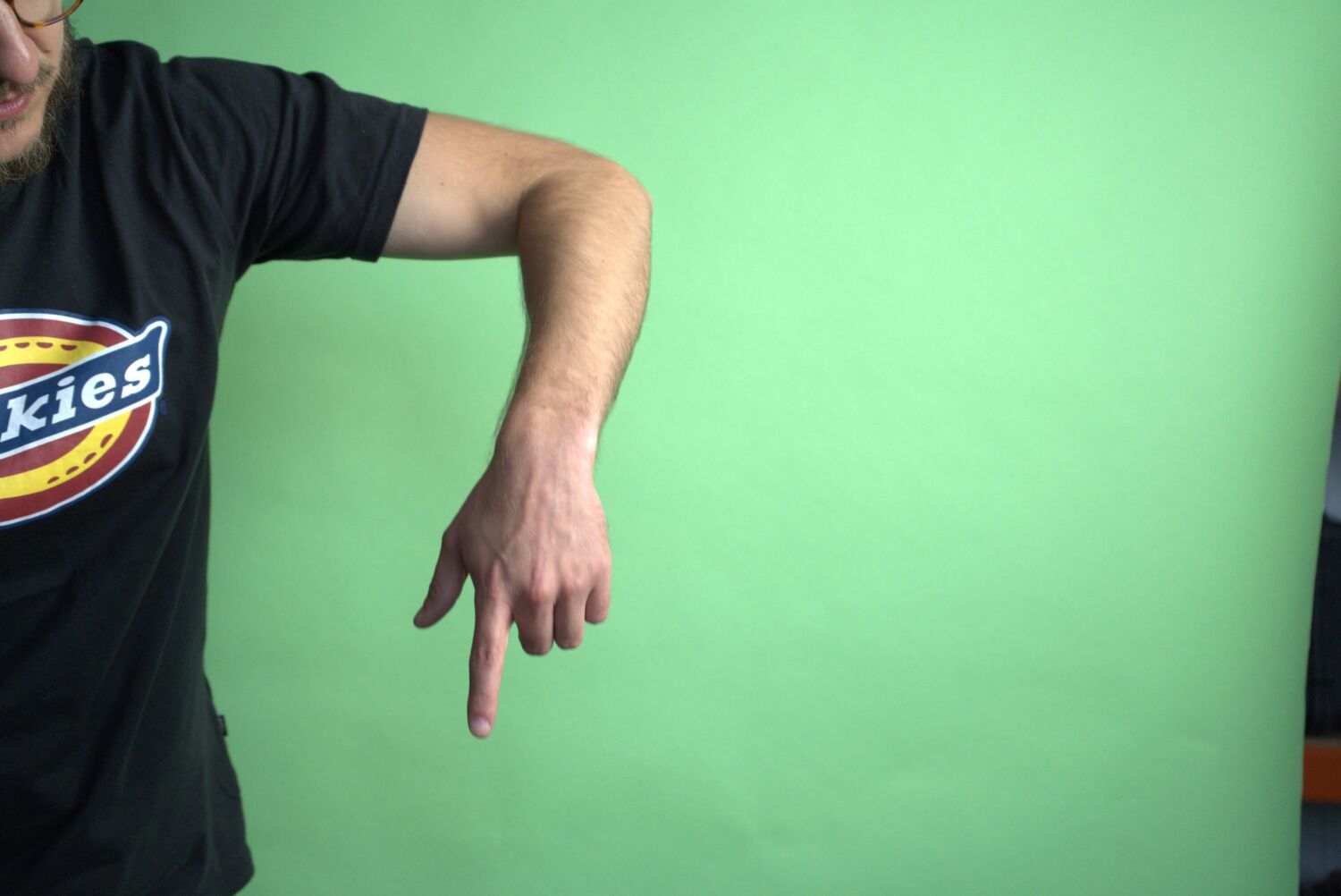
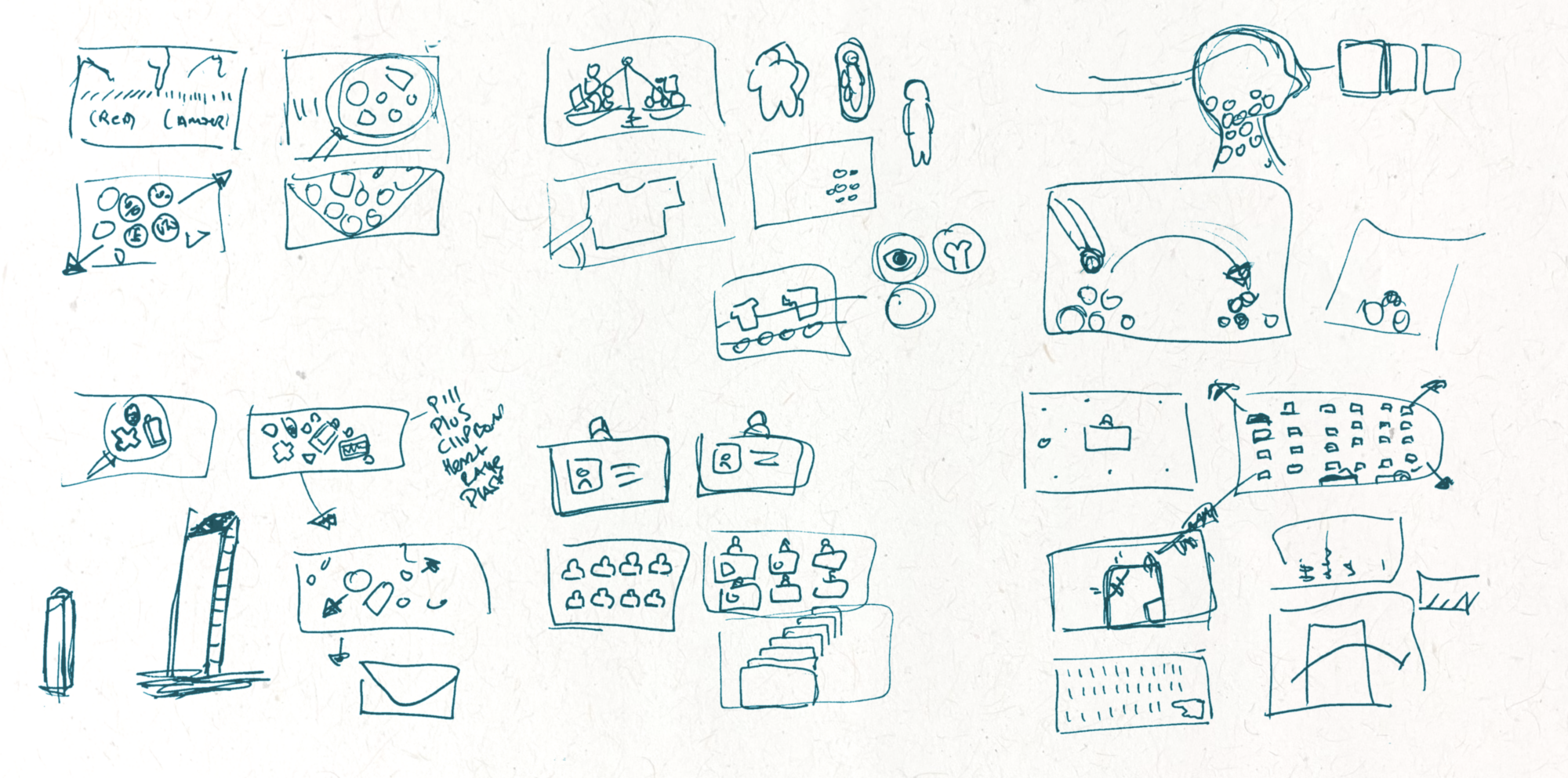
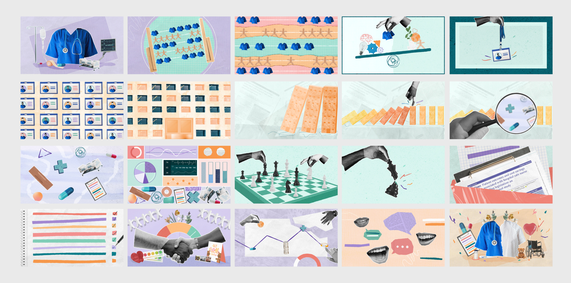
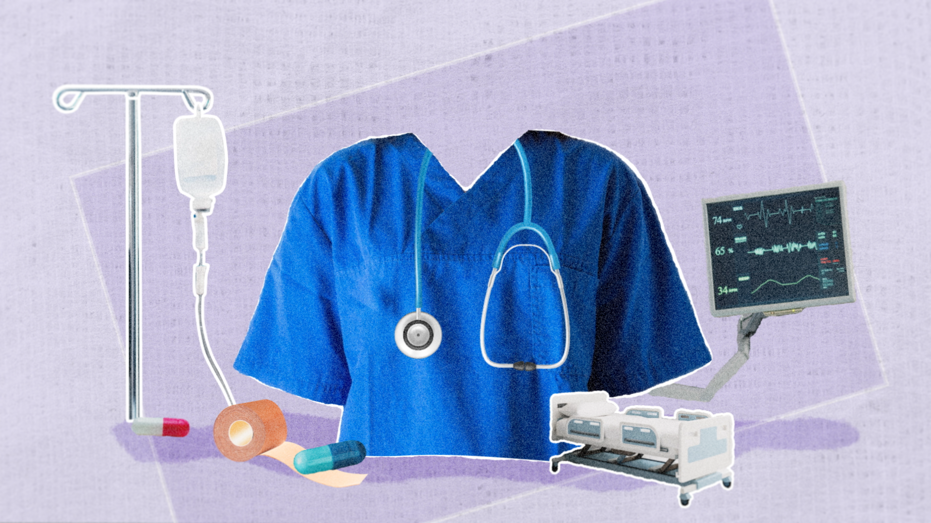
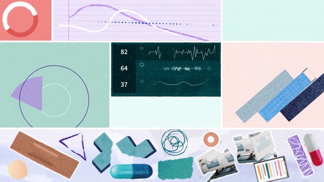
Our approach to design and asset creation for this was one of our favourite so far. We filmed our own sets of hands in a green screen pop up in-house, as well as filming staff members for those talking mouth bits. Visuals and textures were purposeful, using a range of images—like bandages and professional documentation—to create depth and a textured quality.
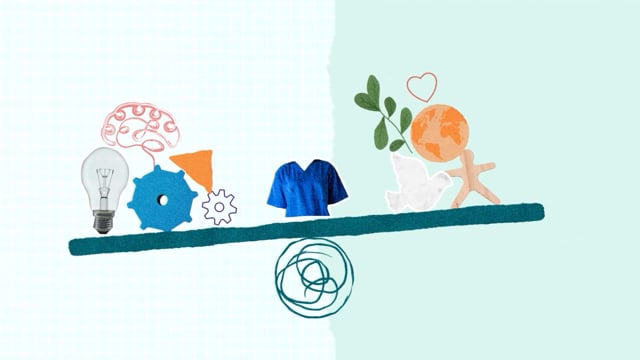
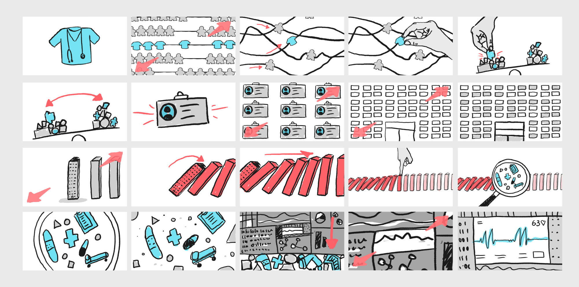
Our designer Izzy was also chucked right in at the deep end and made one of her most extensive "After Effects first" designs to date. This meant she had to collate and build everything ready for our animator Chris to pick up. We love this approach to the motion pipeline and it speaks volumes for how easy the process was between the two departments.
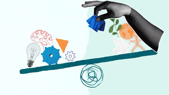
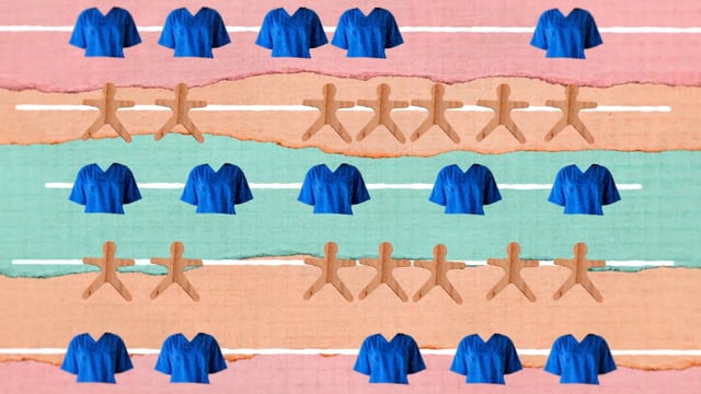
The mograph team learnt so much from this process which allowed for an even more streamlined approach to this workflow moving forward.
We’ve been begging to get our teeth into a mixed media piece, with drop-frame animation and texturally rich illustrations for that tactile feel. Chris really brought those lovely designs to life and everyone involved was super happy with the end visuals. The considered and fitting style really helped to allow the messaging to be king, with a lovely look and feel boosting that production value!
Mac Nixon
Matt JR Smith
Lewys Hobden
Izzy Young
Chris Varaies
Eryn Sivak
Mac Nixon

