Hyve Group
Bett Content Planning
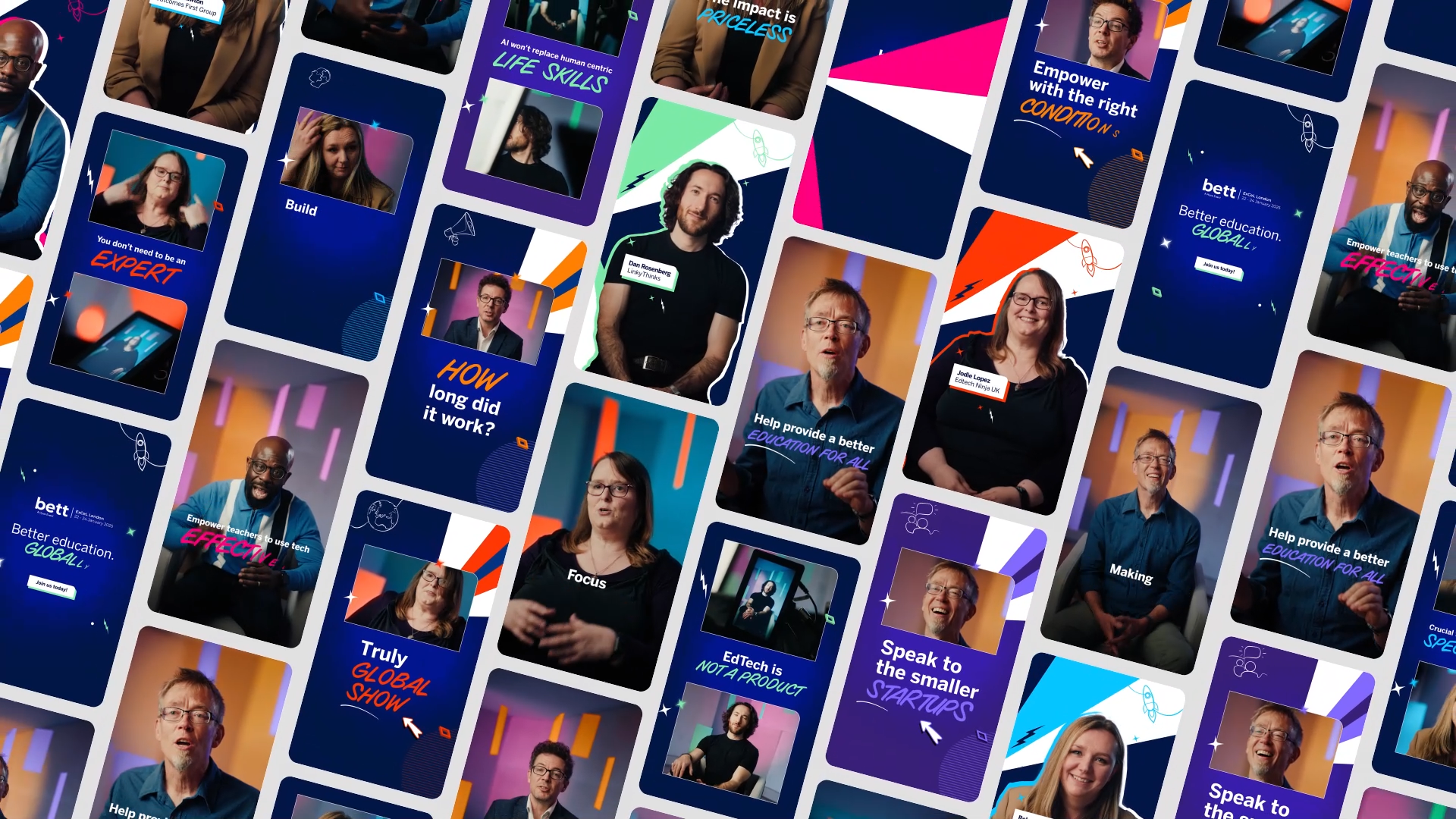
A suite of attention-grabbing social content that captivates and attracts a wider audience to Edtech? Sign us up!
BETT is driving the conversation forward; its global events and platforms are bursting at the seams with thought-provoking discussions, show-stopping innovations, and exciting glimpses into the future of education. They came to us needing a series of punchy, social-first content that would expand their presence beyond the event floor and firmly establish edtech as an exciting and game-changing conversation that fresh-faced viewers wouldn’t want to miss.
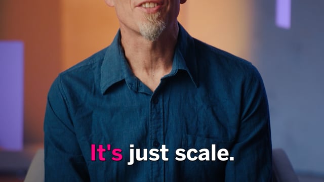
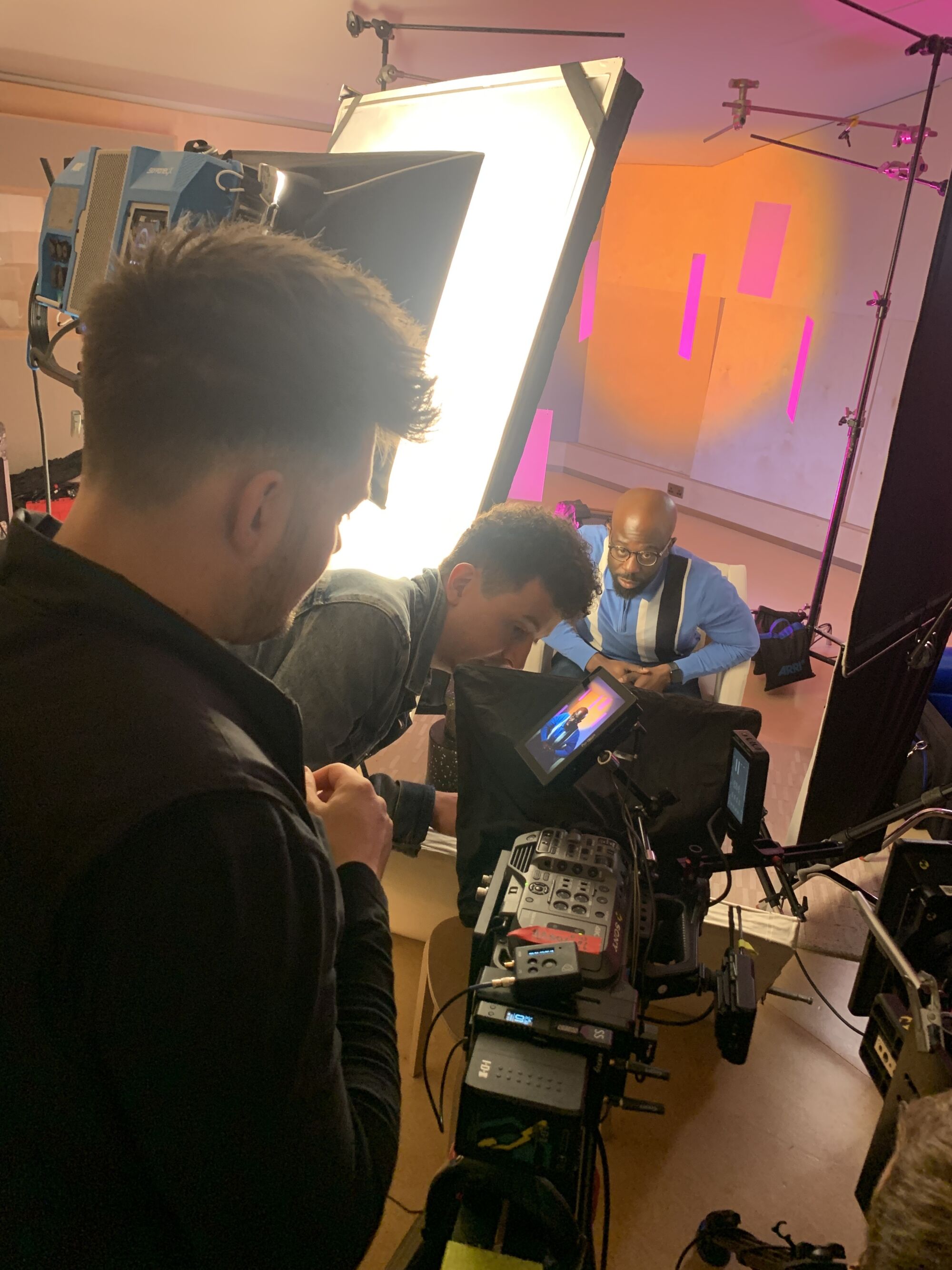
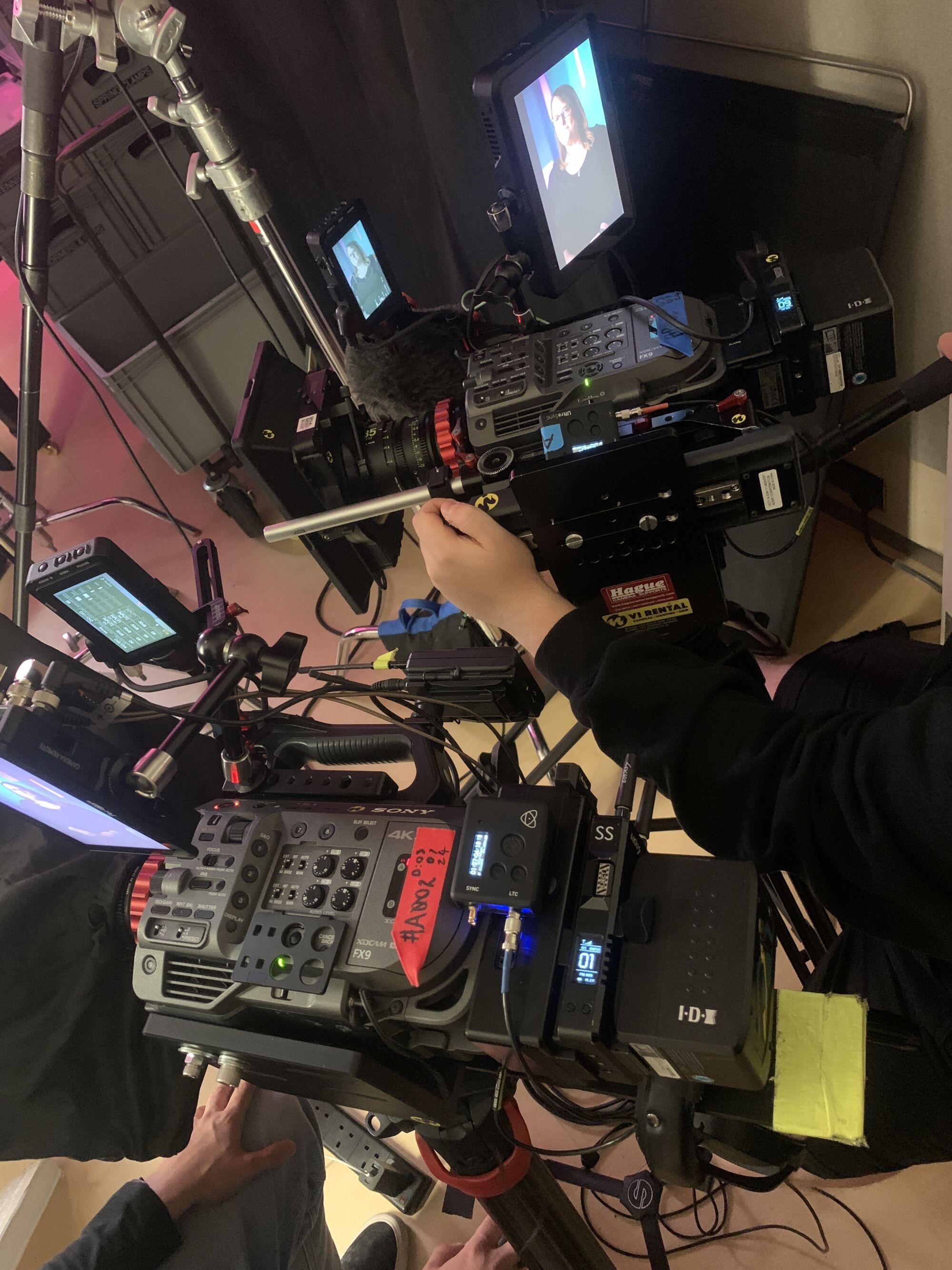
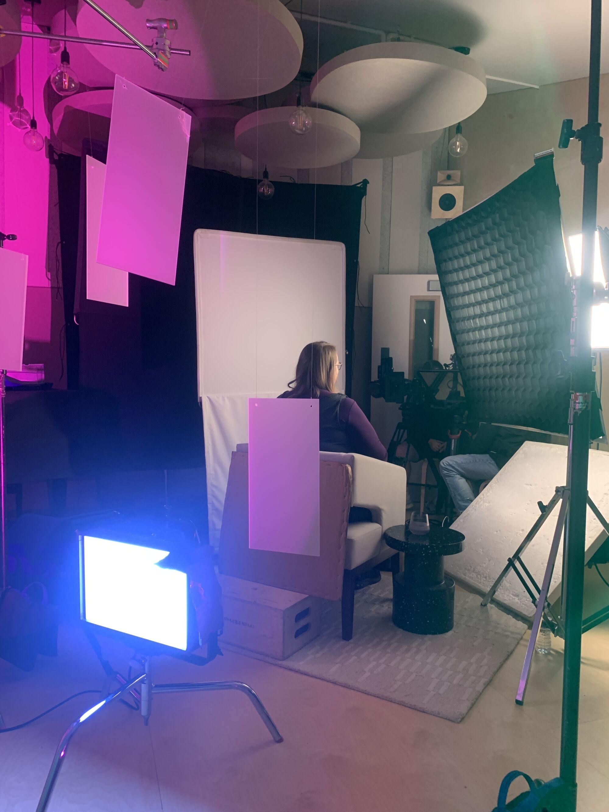
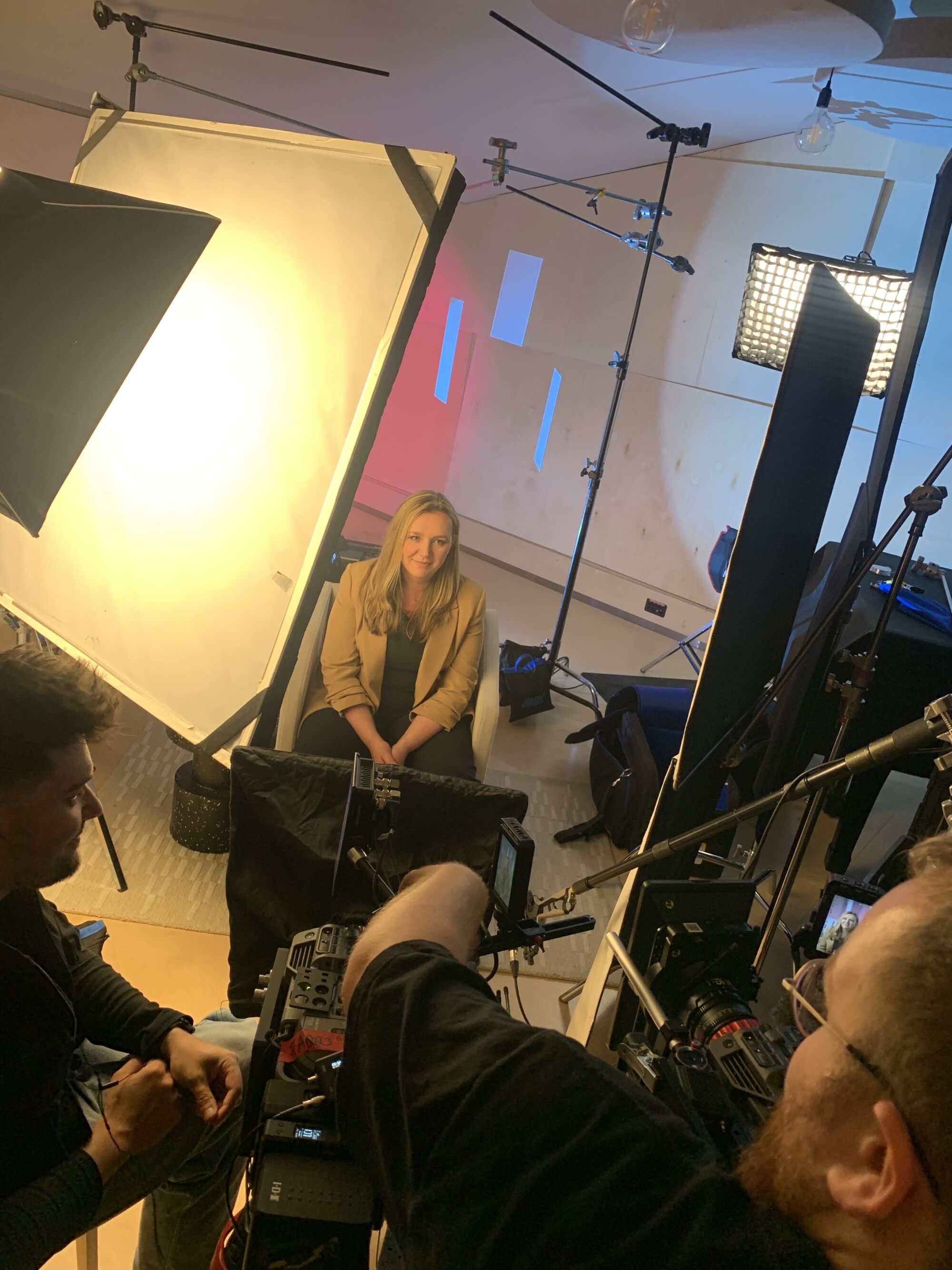
We were tasked with creating 15- to 30-second people-focused videos that would spark interest, drive global event attendance and demystify edtech for those who might feel daunted by the topic. We wanted a lot from a little: minimal setups, maximum output. Our goal was to ensure that each piece of content felt engaging and stopped people in their tracks from the first 5 seconds, all while keeping the shoot simple and the design stripped back. The videos needed to stay focused on BETT’s message, so we used a combination of filmed interviews and motion graphics to hit that balance.
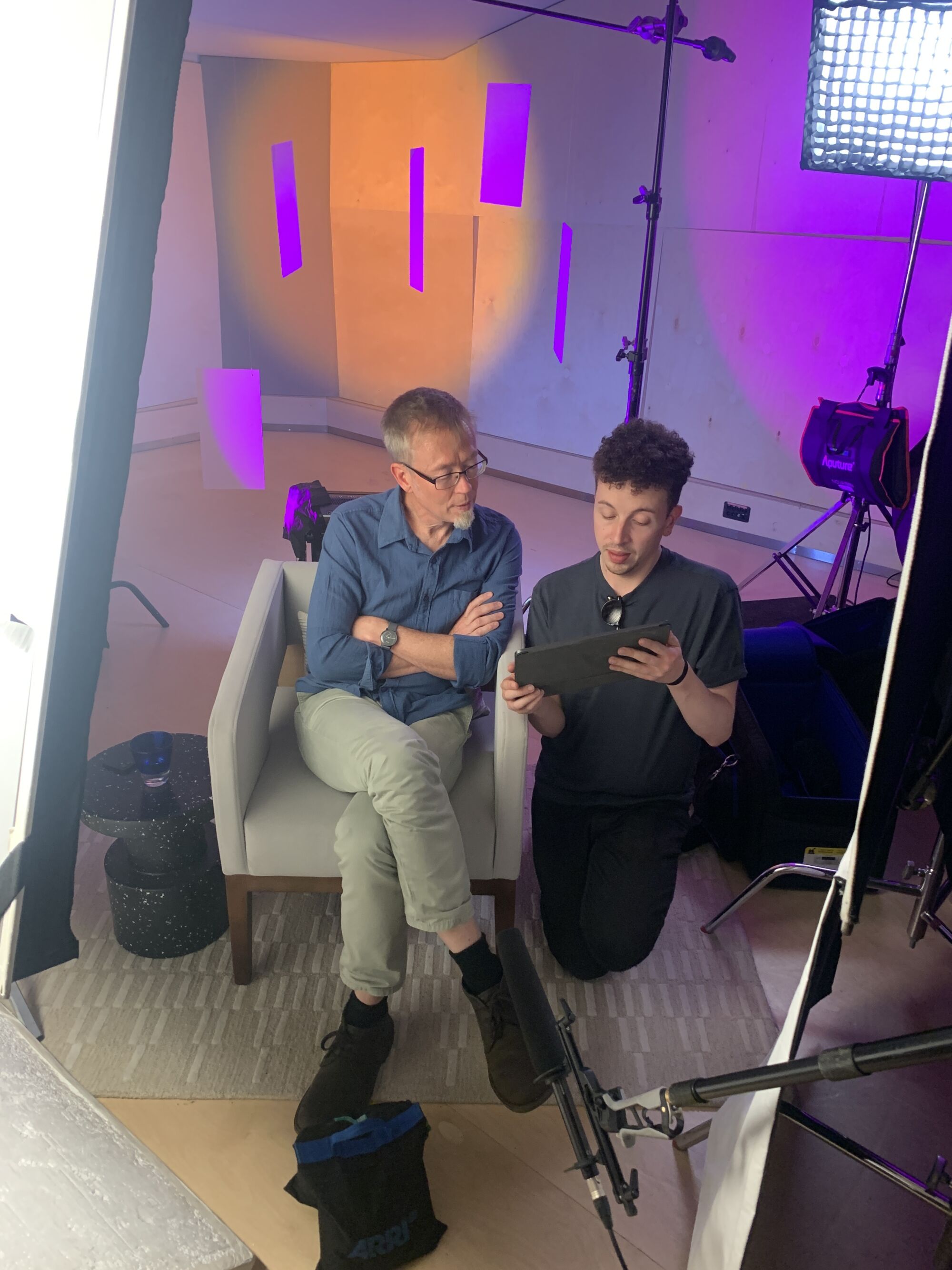
We kicked things off with discovery calls with our central participants; these were comprised of key figures, trailblazers and exciting voices from the world of education and tech.
We had frank and insightful conversations with these individuals to quickly identify how their unique perspectives and controversial opinions could be structured into theme-driven and trend-based talking points that would make for engaging, scroll-stopping videos. From here we produced loosely outlined scripts to ensure the messaging and takeaways could be delivered impactfully on the filming day within our 15-30 second window.
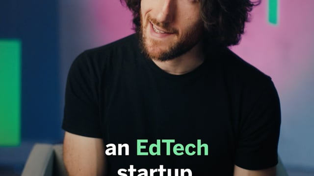
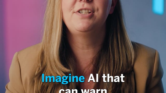
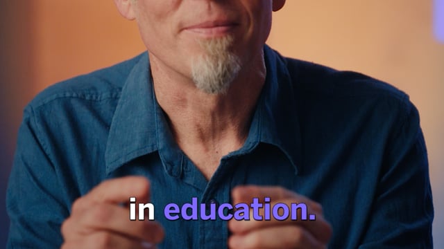
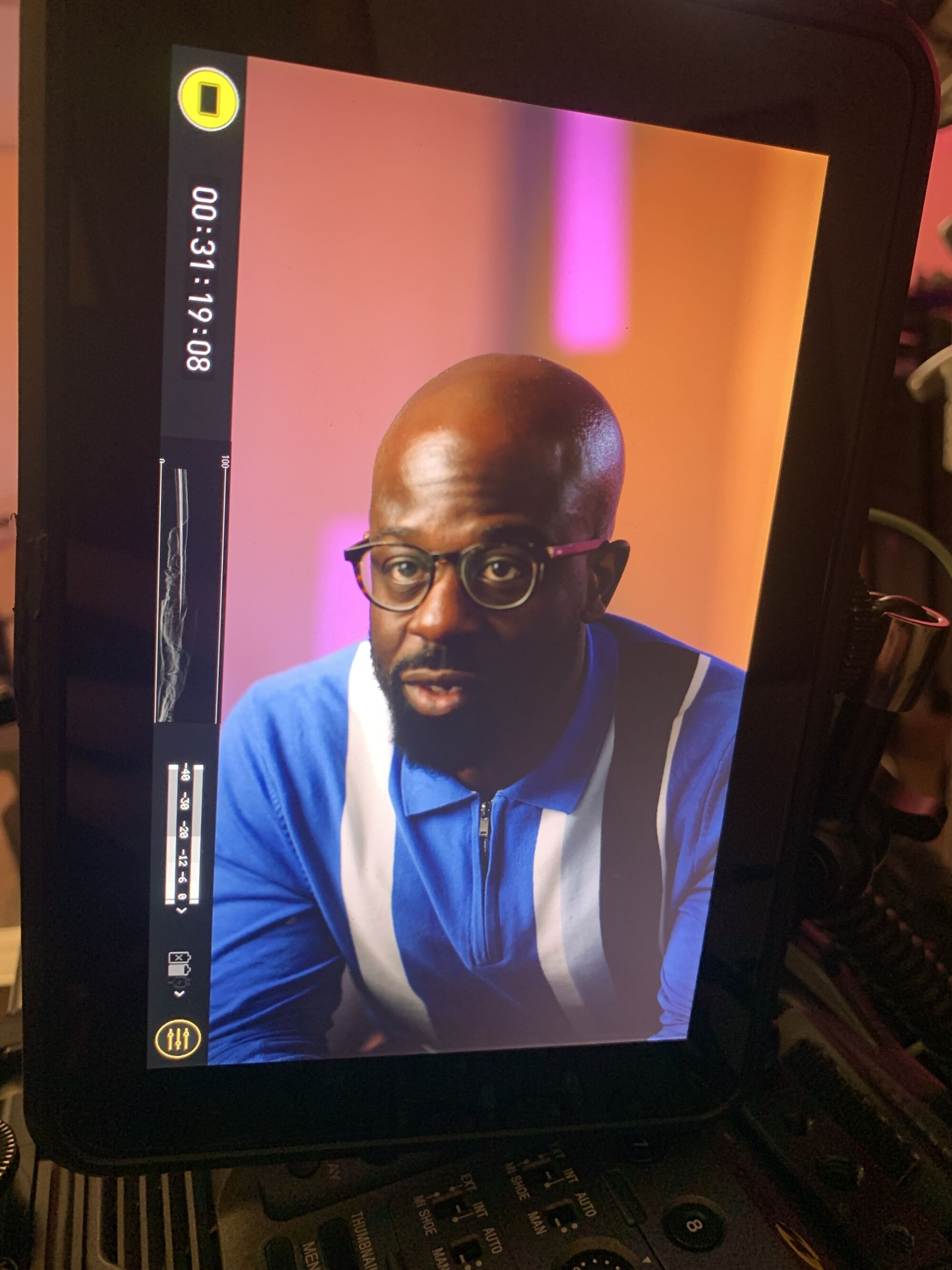
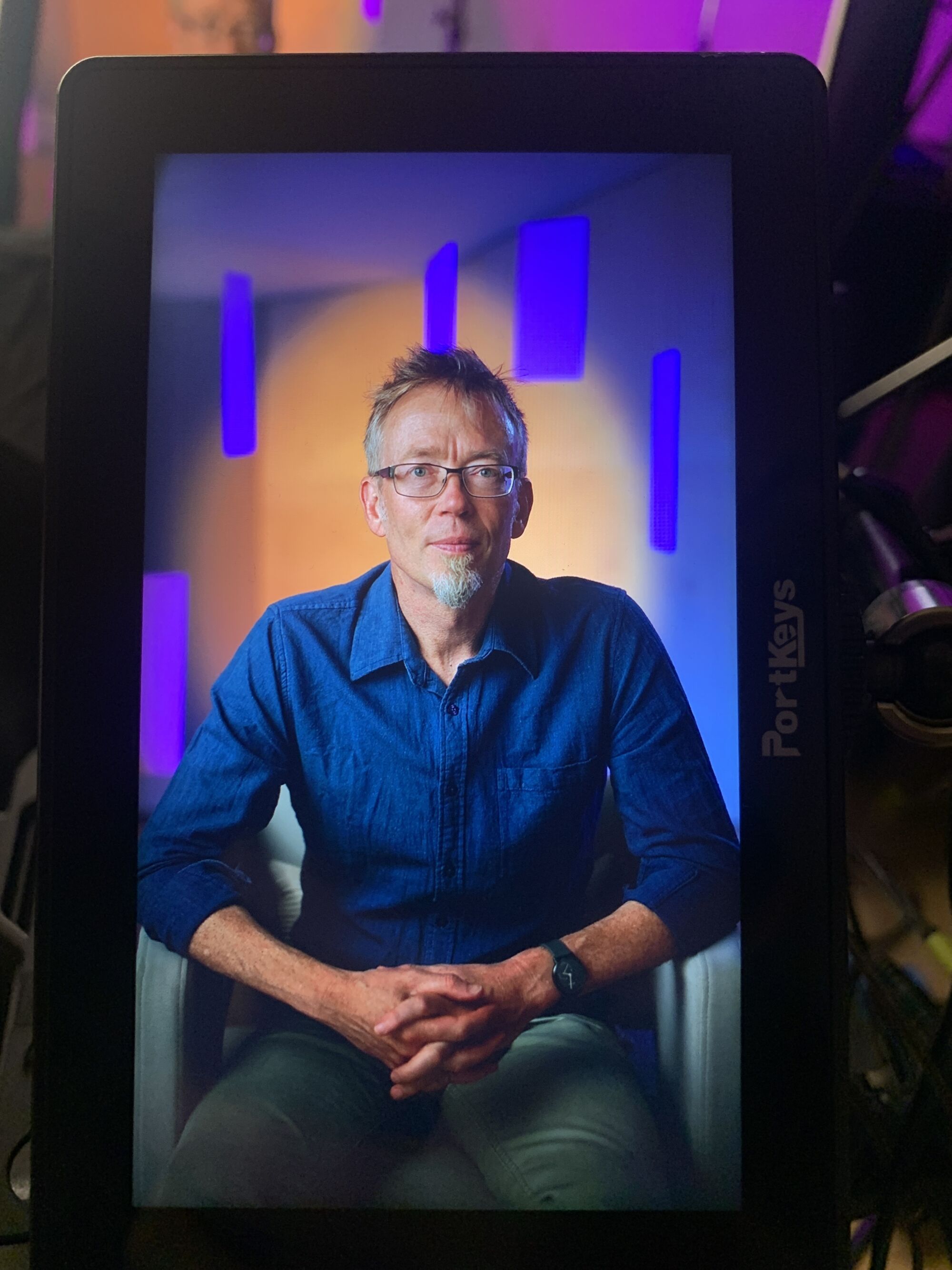
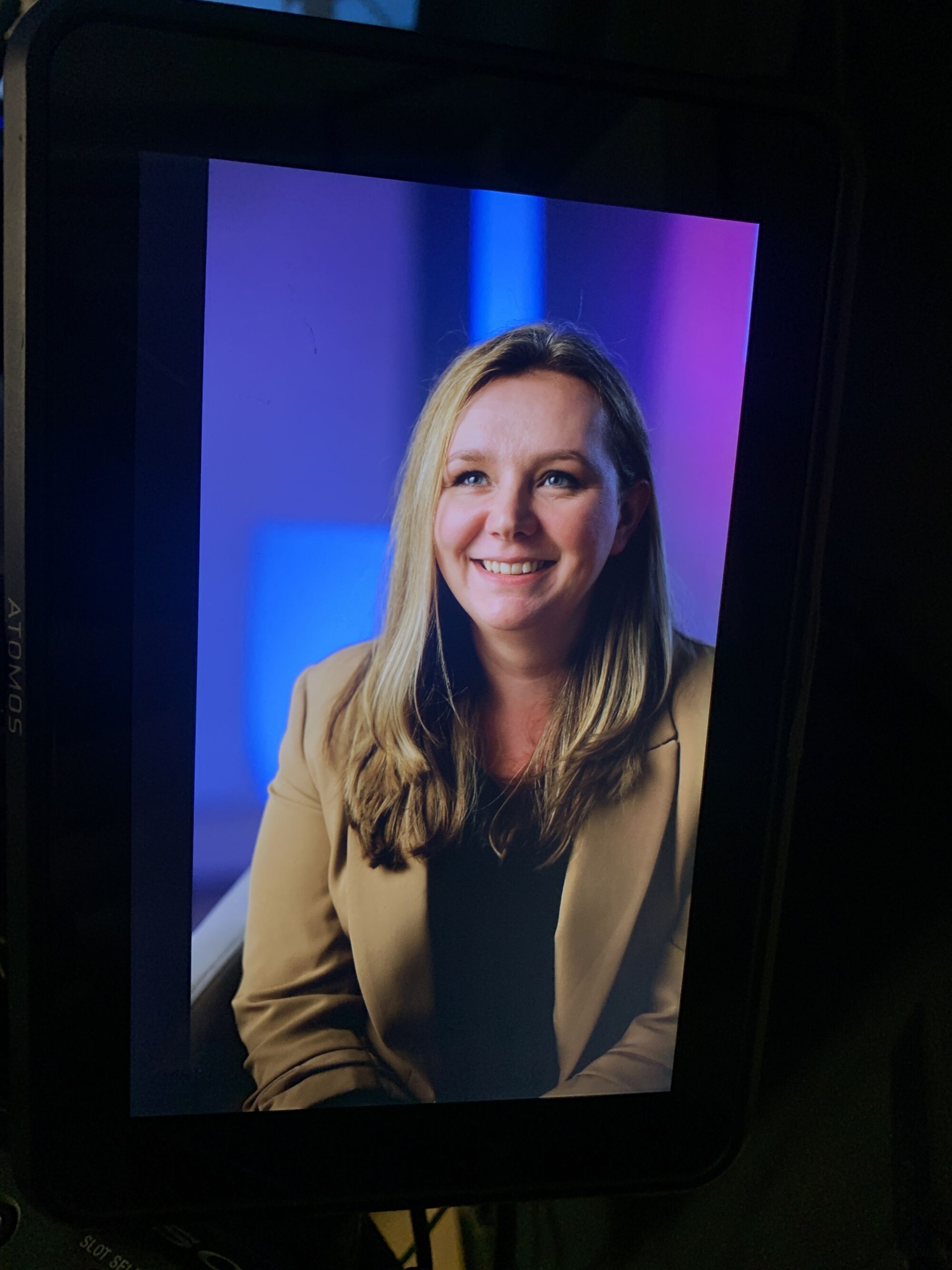
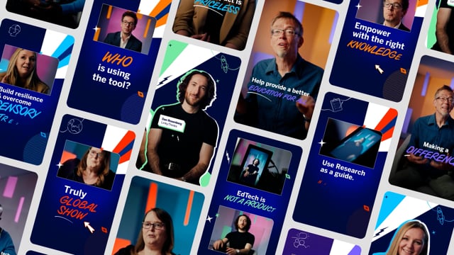
We wanted our visual approach for the series to strike a balance between being bright and approachable as well as an aesthetic that felt eye-catching and professional. The videos, which would be shot and designed exclusively for the 9:16 and 4:5 aspect ratios, needed to feel cohesive across the entire suite of content, but we also wanted each speaker to have their own identity.
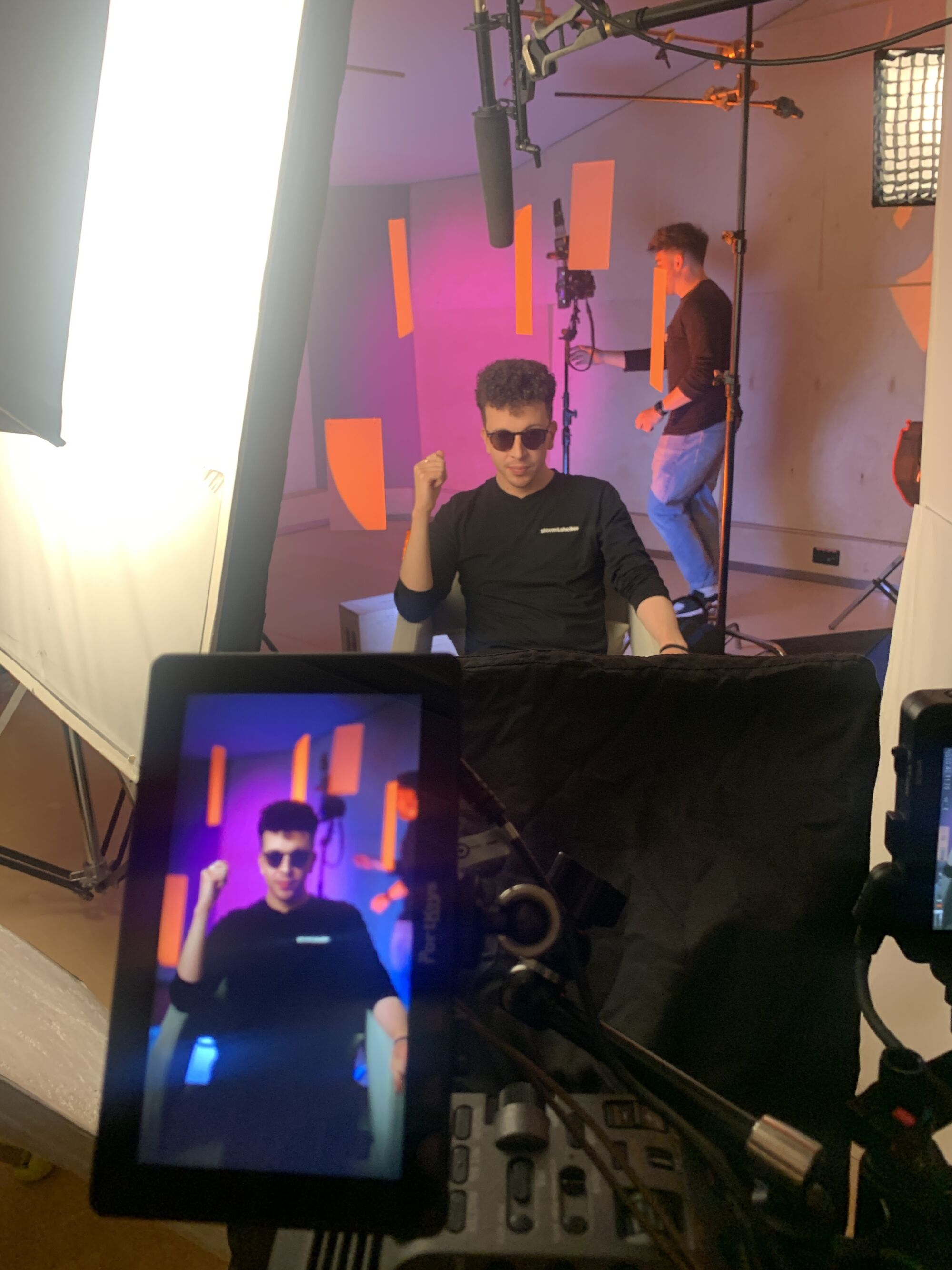
To do this, we kept the core design consistent but gave each piece a distinct colour from BETT’s branding. This not only made the videos recognisably part of a set but allowed them to stand out individually when viewed on their own. We even tied these colours back into the filmed footage by using matching perspex shapes on set, creating a seamless connection between the physical and digital elements.
The result? A polished, professional feel that didn’t lose its edge!
The videos have gone down really well, have had some great engagement and most of them have cooked up some nice conversation in the comments!
Motion graphics played a crucial role in providing audiences with clear messaging and digestible takeaways. We used bold, animated text to punch through and elevate the soundbites, while keeping the visual style clean and in line with BETT’s brand guidelines.
It wasn’t just about making things look pretty—it was about ensuring the messaging cut through to a social audience with clarity. Quickfire and eye-catching subtitles were also implemented with the help of our friend, SubMachine, an auto-caption plugin which allowed us to produce high-quality subtitles across our vast number of deliverables whilst keeping things efficient and on budget.
The content not only caught the eye but maintained BETT’s branding across all social channels, giving them an engaging, flexible social series to roll out throughout the year. The final suite of videos hit the mark—punchy, visually striking and successfully fostering exciting conversations on BETT’s social feeds.
The client was thrilled with the final pieces as well as the collaborative process we created throughout the entire process.
Mac Nixon
Matt Smith
Nikita Dare
Dave Anderson
Lewis Jelley
Liam Rees
Izzy Young
Eryn Sivak
Liam Rees
