Amsterdam Night Portraits: Shooting Like Brandon Woelfel
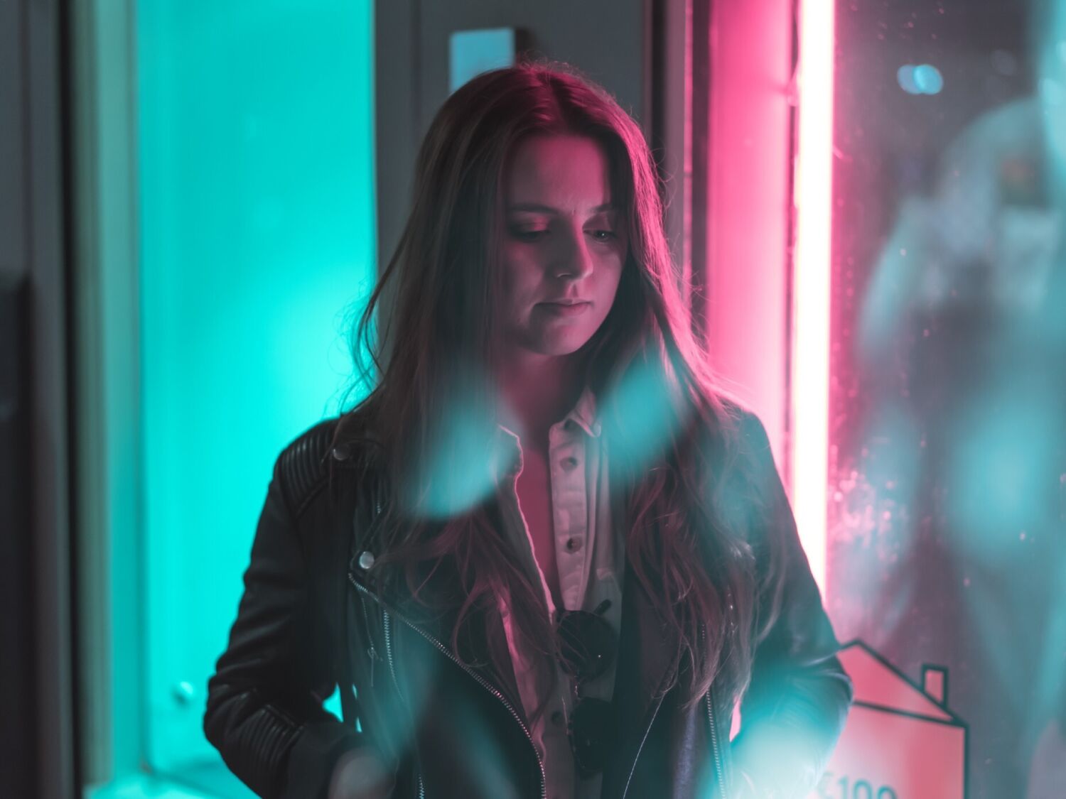
Upon landing in Amsterdam for IBC last Sunday afternoon, we found ourselves with an evening to kill.
Not satisfied with the idea of sitting in a coffeeshop or getting an early night, we decided to head out for a walk around the city.
Earlier in the week Alex and myself had been looking at the photography of Brandon Woelfel, a recently famous Instagrammer, known for his distinct and stylistic portraiture. In his photography, Brandon makes use of available street lights and glass elements to tastefully distort his images.
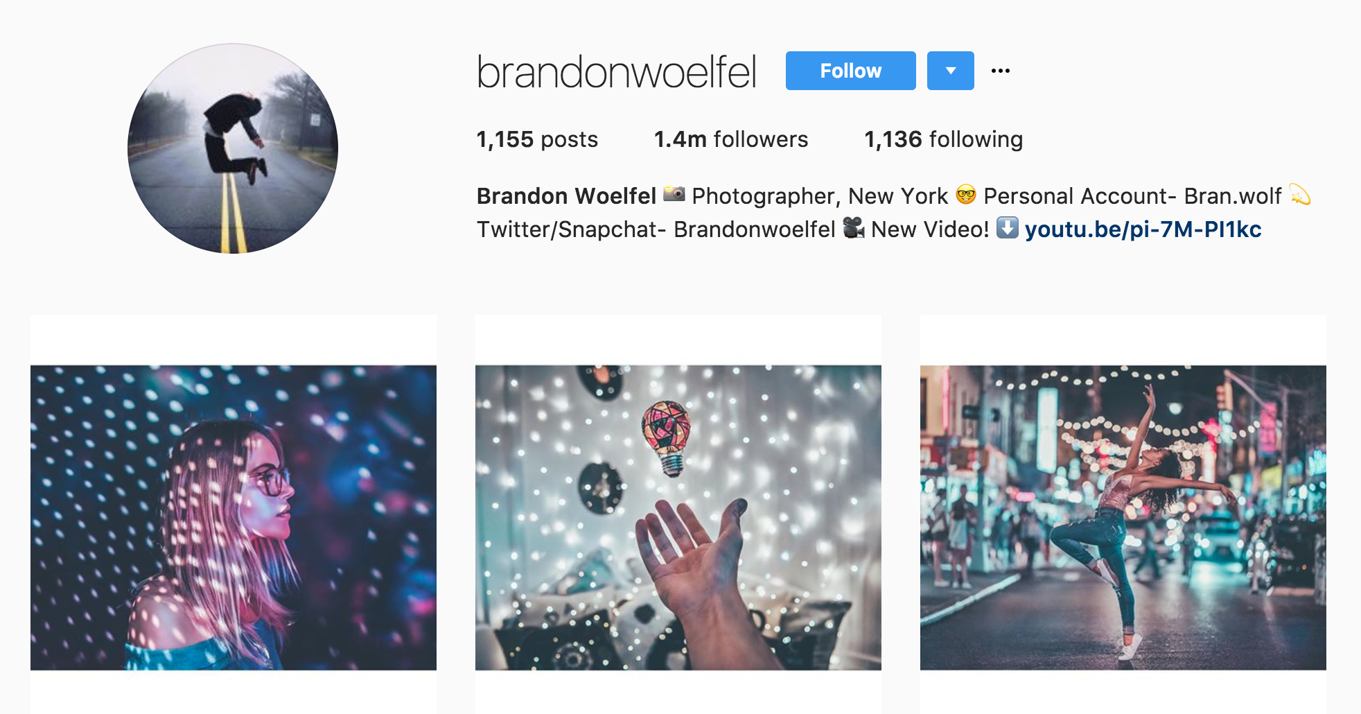
We were in Amsterdam, a city filled with neon lights, home of the red light district. If anywhere was going to be suitable for this type of portraiture, it was Amsterdam.
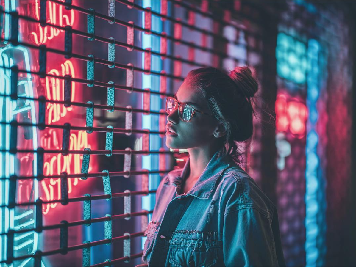
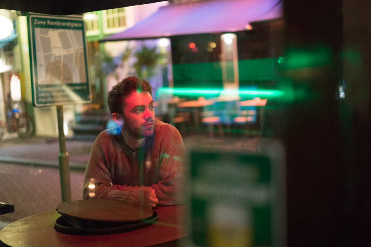
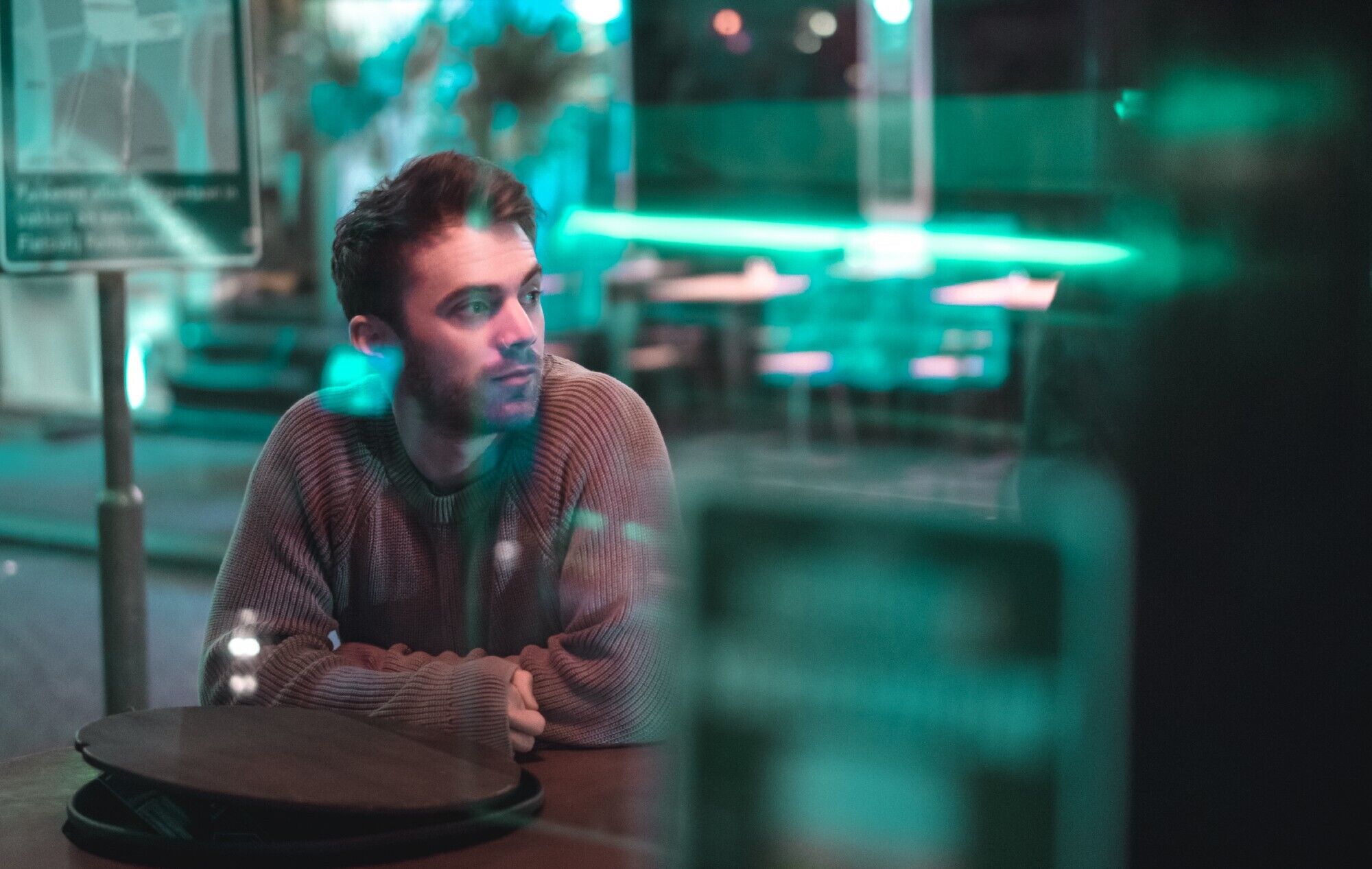
Unfortunately we weren’t in the presence of any model types, so we had to settle for taking it in turns to play model and photographer. With 3 hours to kill and Alex’s trusty Sony a7Rii, we headed out into the night in search of neon.
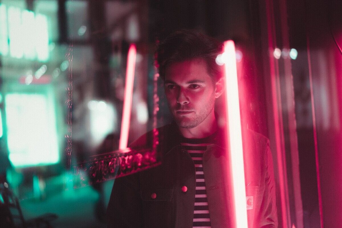
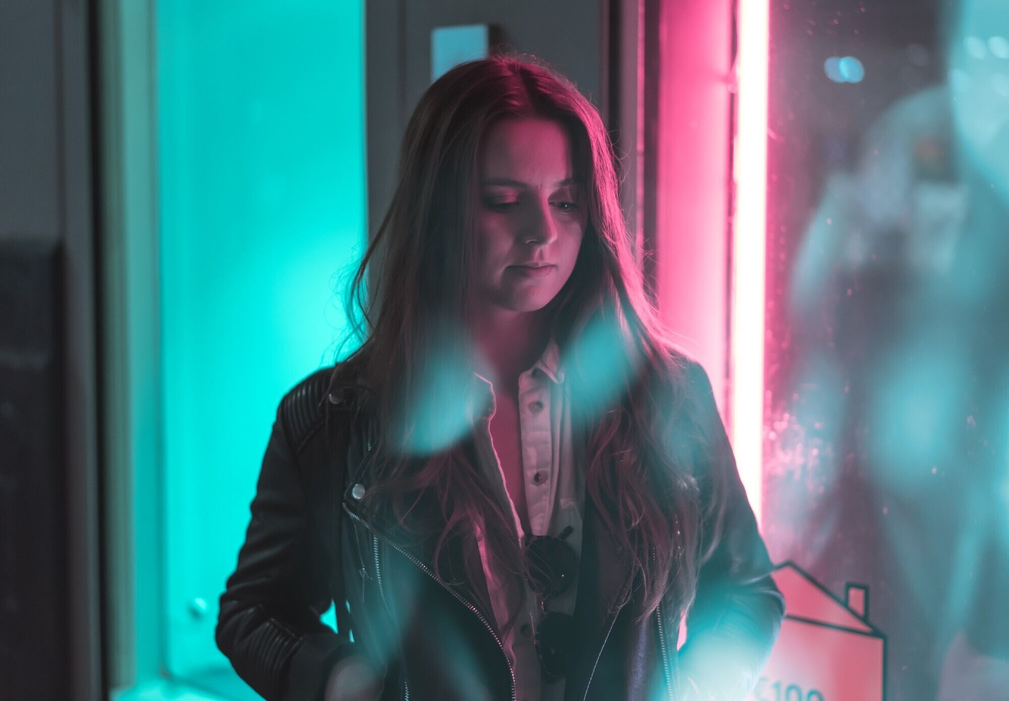
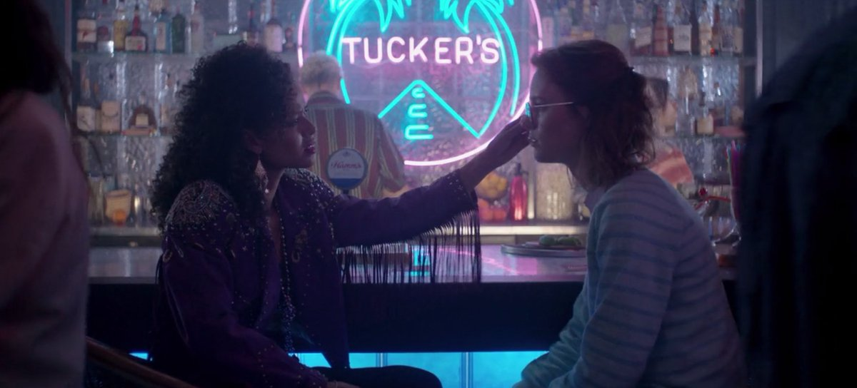
One of the main aesthetic components of Brandon’s photography is colour contrast. He cleverly manipulates the colours available to him in street lighting and transforms them into tones that create a certain mood. He is well known for his use of teal and pink hues, which are nostalgic of the 80s motel noir movement. This palette is enjoying somewhat of a renaissance at the moment, and has become extremely popular in contemporary filmmaking — notably in the San Junipero episode of Black Mirror, which was by far the most watched episode of the last season.
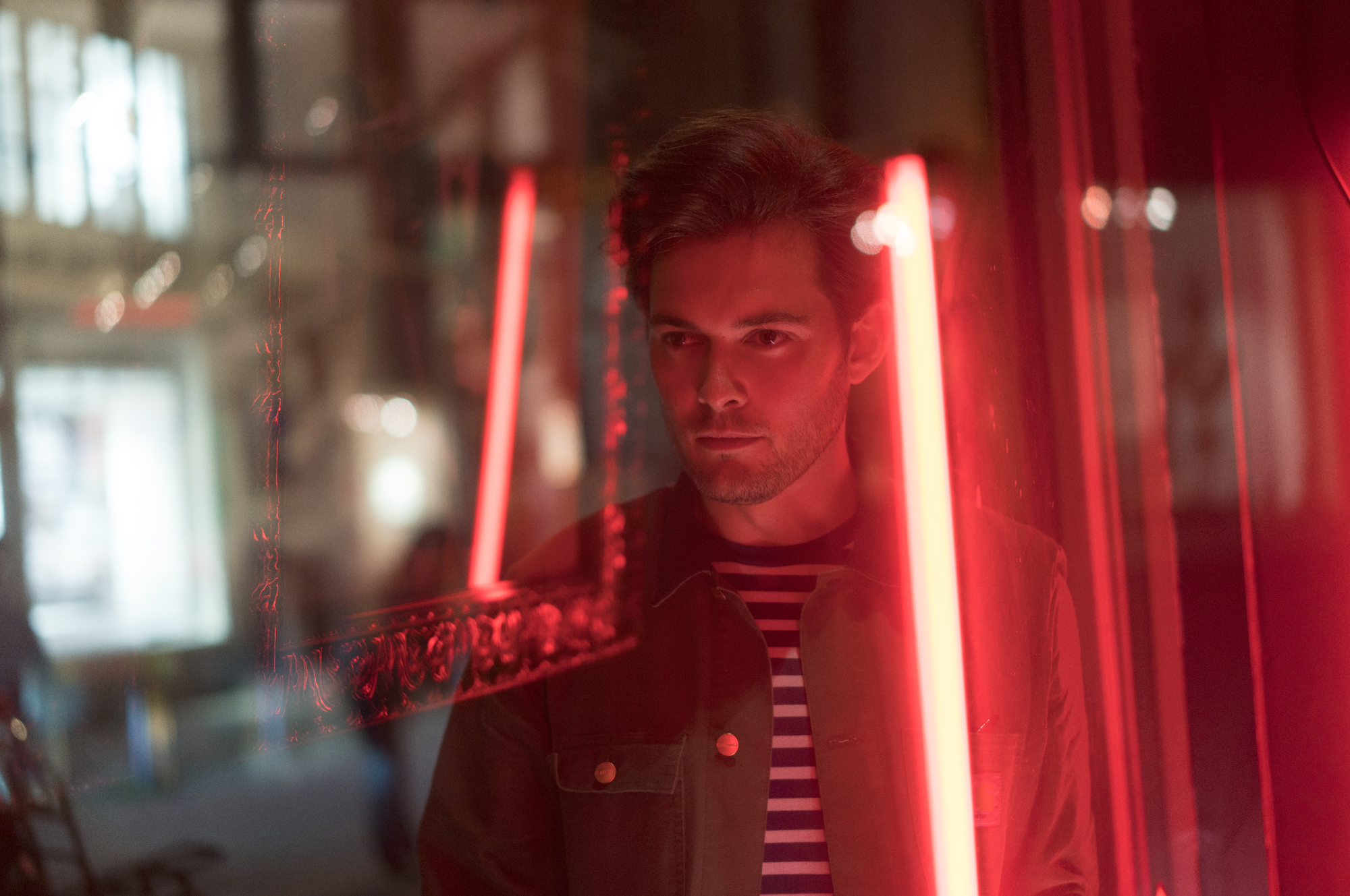
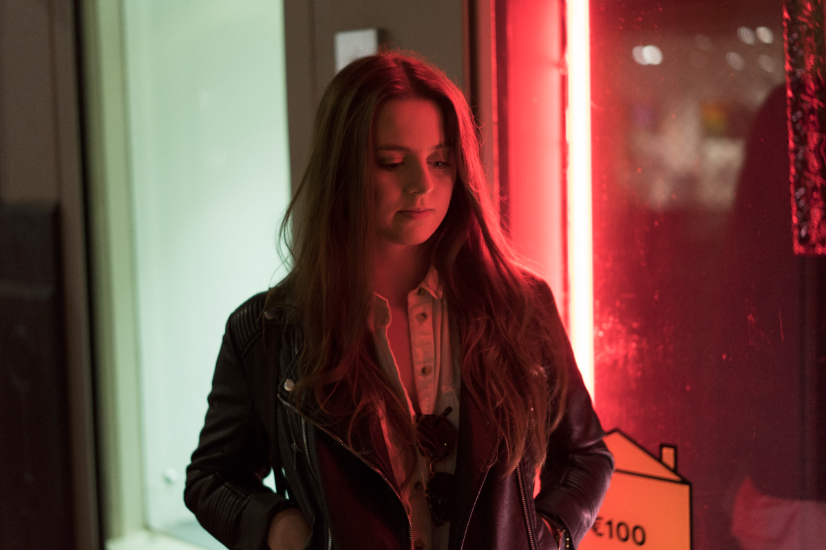
For this reason, when wandering the streets of the ‘Dam, we were mainly scanning our surroundings for spots that had green and red light sources juxtaposed. We happened upon two such locations on our jaunt across town: an art gallery window and an Irish-themed pub.
The main challenge in Lightroom when editing these pictures was manipulating the colour hues. The HSL adjustment tool in LR proved to be very useful. Reducing the contrast in the shadows and giving the image a general lift was important, as well as softening off the highlights. Brandon does a really good job of boosting clarity whilst softening the skin, which we very haphazardly achieved by increasing the clarity and using a heavy noise reduction. It was effective, but a bit of a broad-brush attempt at something which is probably done by Brandon with finer adjustments.
All in all, I don’t think this was too bad as a first effort. I think with more research and test shoots we could really start to deconstruct the techniques and nuances behind this style. We’ll just have to settle for some nice profile pictures for now!
