Cinematography Breakdown: Icarus

As someone who’s idea of creativity revolves around planning everything down to the finest detail, I’m often heard rambling on...
...about how limiting the amount of locations and characters we use to tell a story can have a direct and positive effect on the amount of budget and production value we can pour into the one location we decide to shoot in. You can imagine my excitement when a music video came in that required one main location and one character.
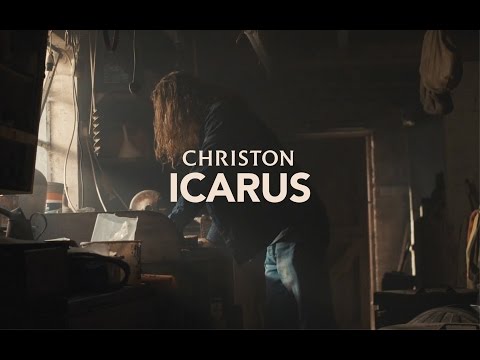
The music video for Christon’s ‘Icarus’ takes a modern, hipster spin on the myth of Icarus, painting him as a 21st century recluse with a knack for craftsmanship. I really liked the idea of playing on certain stereotypes surrounding modern portrait-style documentary pieces. A laugh is often shared in the office at the sheer amount of motorcycle engineering videos we see pop up on Vimeo in that short documentary form.
There have been so many that I found it pretty easy to recognise the clichés: moody, atmospheric vibes coupled with that teal and orange colour palette drawing contrasts between metal and fire, the cold outdoors and warm indoors.
I thought it would an interesting idea to take these clichés and apply them to a music video about a man who is trying to craft something ridiculous and impossible — a set of wings. I guess that’s how I imagined the modern day Icarus looking.
Instead of rambling on in this post about lighting set ups, which I’ve done in recent posts, I want to focus on the comparisons between the clichés that I’d spotted and how I recreated them in our film. So I’ll keep the lighting explanation brief: We pretty much just reinforced the practical light in the workshop using extra tungsten bulbs which we hung and ran dimmers through, mostly to lift the background and add texture to the scene. We used one Dedolight 150w fresnel to deliver a bit more focus and contrast to a specific area when needed. The blue tones came from a sky light which was luckily exactly where I would have placed it myself given the choice, so I only really had to reinforce it with a soft panel once when we were running a lighting gag. Naturally, we piled in the haze.
Anyway, as I was saying, I kind of want this post to be about real life clichés vs. our recreation for fictional narrative. Please take a look below at a couple of images from our mood board. If you scroll down past them you’ll be able to see stills from our finished film. You can draw your own conclusions on how well we did.


I was actually pretty surprised at how easy it was to achieve the desired look, and I think it stands as a pretty good case study on how effective mood boards can be as a reference when re-creating images.
That’s it for another instalment of Cinematography Breakdown, like I mentioned last week, if there’s anything I can improve, do differently or add more or less detail to, get in touch! I love talking about this stuff.

