MoGraph (not so) Monthly: Behind The Scenes

Here at STORM+SHELTER, one of our core values is ‘Go a step further’.
Although that could sound like a bit of HR fluff, what that boils down to is that if we’re not pushing and challenging ourselves to be better, then we won’t be able to produce kick-ass content for our clients and get excited about what we create. And that’s not good for anyone.
We love to learn and sometimes there are techniques that we know we could do but just haven’t had the chance to try out. Enter MoGraph Monthly*. A dedicated time for our Graphics & Animation team to flex their creative freedom in styles they have wanted to try their hand at, without the pressure of a client looking over their shoulder.
These posts are created with our social channels in mind, so go give them a follow to witness them properly. Consider this a behind-the-scenes tour.
*Oh, you’ll have to excuse the name. MoGraph Monthly was originally intended to be an internal name but when it came to writing this blog, something unnecessarily swish like Demo-Graphics or Motion Tactics felt a little off-brand. So it’ll stick (for now).
Let’s talk about type
March 2022
Design: Izzy Young
Animation: Eryn Sivak
Key Development Points: Typography, Transitions
For some of our more corporate clients, we used typography A LOT. Though sometimes, the constraints of what we can do can be quite… limiting. Which can be a bit of a shame. So for this project, we wanted to push ourselves to do something a little different and be a great reference point for pitches to show how dynamic just typography can be.
Izzy led the charge with this one and was keen on exploring lots of different aspects of type and how they can move. Using a consistent palette as an anchor, she then had full reign to explore different fonts, designs and layouts whilst still having a cohesive feel.
As part of the design process, Izzy had a clear idea of how it should move, so when it came to animation, it was pretty much a ‘get straight into it’ approach from Eryn. Using the base of the track to lead the timings, everything came together into this slick loop.
Do u even lift, bro?
June 2021
Design: Izzy Young
Animation: Eryn Sivak, Michael Kenny
Sound Design: Michael Kenny
Key Development Points: Movement, Simplicity
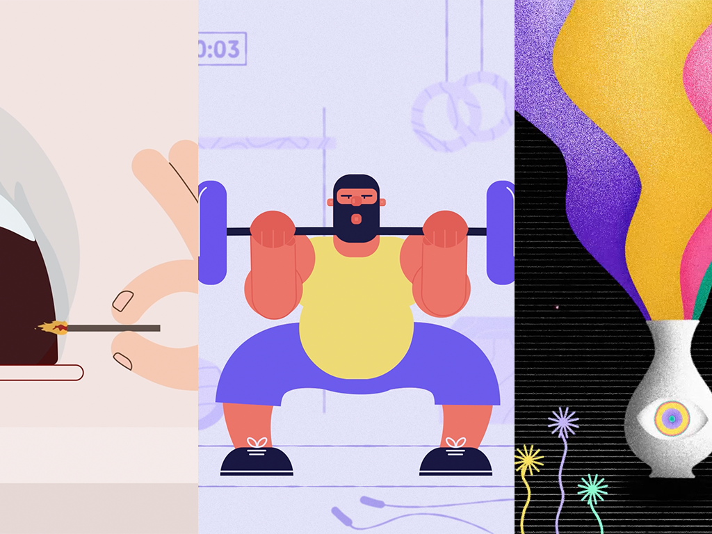
Izzy is a HUGE fan of CrossFit. While some of us are too busy pressing snooze, she is out there doing burpees (or whatever it is those sporty types do). In fact, lots of us Stormies are pretty active, so that’s why when gyms reopened we wanted to create something to celebrate.
Our latest editing recruit Michael was super keen to get involved and flex his MoGraph muscles. It was decided he would take on a bulk of the main animation, with Eryn acting as a guiding line and focusing on the background and any final tweaks.
It took a little bit of time to decide what exactly our gym-bunny would be doing, but eventually, we settled on weights. The weight lifting stance meant that Izzy could focus on a slightly atypical standing position and meant that Michael could really think about the physics and impact weights would have on a body and its movement.
The collab between all three jelled nicely and the team were happy with the end design. Way to rep-resent!
Askin’ The Big Questions
May 2021
Design: Izzy Young
Animation: Eryn Sivak
Sound Design: Josh Bennett
Key Development Points: Transition, Narrative
Ah, International Design Day. After Christmas, the team’s second favourite day of the year (yes, that includes their birthdays). Since we launched MoGraph Monthly, we had the concept in the bank ready to go and with Izzy at the reins of this one, we were ready to execute her clear vision.
Essentially, the concept was something to celebrate our creative process at STORM+SHELTER, with a particular focus on aspects that we knew would be fun to animate such as the font choices and colour profiling.
We like to think we’re pretty painless to work with and wanted to reflect that with an emphasis on seamless transitions and once Josh added in some relaxing sound design it all came together.
Dinosaurs & Aliens
April 2021
Design: Izzy Young
Animation: Eryn Sivak
Sound Design: Josh Bennett
Key Development Points: Narrative, Perspective
Gotcha! You thought you thought we’d do an April fools related post, didn’t you?
Have a weird fact instead.
For this month, there was less of a technique we wanted to focus on but instead wanted to test or short-form storytelling skills in a way that was friendly for social media. Our office resident space nerd Gruff randomly brought up a pretty unbelievable piece of trivia, and we were away.
Over the last few months, we’ve got into a groove design-wise: lots of black with pops of colour and texture to give it depth. The team are really digging it, so we wanted to keep that flow going with this post alongside some eccentric sound design from our quirky-girl Josh Bennett.
Satisfying Loops
February 2021
Design: Izzy Young
Animation: Eryn Sivak
Key Development Points: Texture, Loops, Abstraction
Long-form narrative style animation is great, it’s our bread and butter, but for this month it was all about the aesthetic. We wanted to create something that stopped social scrollers in their tracks and almost force them to double-tap, and what way to do that other than a good loop?
Tired of bright colour palettes, ex-emo Eryn wanted to do something a little more abstract and dark with a lot more grit. Hopping over to Dribble, she created a mood board and handed it over to Izzy to start fleshing out the concept on Procreate.
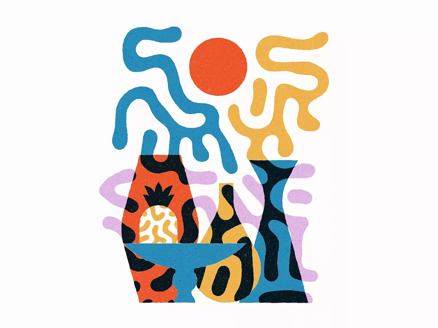
Credit ILLO. Pavlov Visuals on Dribble
As texture was going to play a major role, we integrated the brush textures into the designs before the animation to make them move more organically. We used a mix of key-frame animation but for the more intricate aspects of the loop, Eryn went in and did some frame-by-frame work to give it a satisfying smoothness and slapped on some more grain to give it the grunge we were after.
New Year, New Post
January 2021
Design: Izzy Young
Animation: Eryn Sivak
Key Development Points: Typography, Faux 3D, Transitions
I know we haven’t had a kick-off or anything yet but wondering if we do something typographic? With the word 2021? A new year and all that
And just like, that the idea was set.
Bold typography is something we often recommend for our clients as it allows you to get your message across even if someone is scrolling on silent. Keen to apply it to our own branding, we wanted to focus on smooth and elegant transitions while still keeping things bold and bright.
Here’s to a good year!
A Christmas Helping Hand
December 2020
Design: Izzy Young
Animation: Eryn Sivak
Sound Design: Nick Patterson
Key Development Points: Hands, Montage Animation, Sound Design
Having that human touch to your animation is important to connect with your audience, but sometimes a full character animation can be a little out of grasp for some clients’ budgets.
That’s why for those with a tighter spend, we often suggest focusing on isolated body parts (especially hands), which can still give the desired effect without the need for a full rig. This is occasionally met with a tentative response, so we wanted to prove our point, and this month’s MoGraph Monthly was the perfect opportunity.
Izzy & Eryn are the office’s Christmas queens. They’re the type of people that will stop a Halloween party at midnight just to play Mariah Carey, so they took a handle of creating a montage of what they enjoy most about the holidays with hands being the focal point.
Another key part of this project was integrating sound design from the very beginning so that the movements would align perfectly. We roped in sound master Nick, who showed the team how it’s done and tied everything together nicely in a neat bow.
Bonfire Night
November 2020
Design: Izzy Young
Animation: Izzy Young
Key Development Points: Cut-out effect, Paper Textures
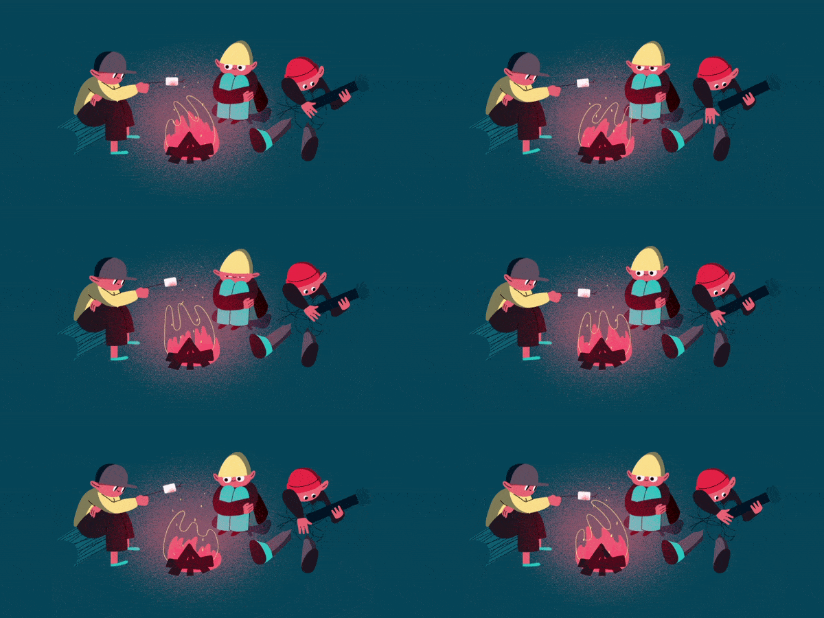
When you look at our personal inspiration mood boards, recently it has been full of designs with raw, homemade textures which is something we rarely get the chance to do for clients. But that’s exactly what MoGraph Monthly is for!
Bonfire Night was just around the corner, and we wanted to make something that captured the joy of going to your first firework display, so we settled on a cut-out paper design that gave it a more homemade feel. The rest of the team were on-hand in case she needed help, but this project was all Izzy — from the concept, through to the animation.
Great job Iz!
MoGraph Monthly is a Go (Go-juice)
September 2020
Design: Izzy Young
Animation: Izzy Young, Eryn Sivak
Key Development Points: Frame-by-frame Animation, Texture, Timing
Welcome to MoGraph Monthly! Our Designer Izzy recently completed the Motion Beast Course, and was busy learning some cool things about texture, grain and so for our inaugural post, we wanted to put our new animation aficionado to the test.
We’d just recently completed a project for Quantum Coffee, so using that as our dive off point, we wanted to create a splash — literally. Animating liquids can be a little elusive at times and it was a great challenge to start stretching Izzy’s newfound skills.
After extensive R&D (i.e. lots of tea rounds), Izzy went in on Procreate & Rough Animator to capture the movement through detailed frame-by-frame animation. Once exported, our in-house MoGraph Master Eryn made some final refinements in After Effects, and it was good to go!
The team were pretty stoked with the results. Here’s what they had to say:
We both learnt a lot about timing, easing and stretching and general movement of liquid for this one and were super happy with the result!
